“A room needs one surface where nothing is happening, or the eye never rests.”
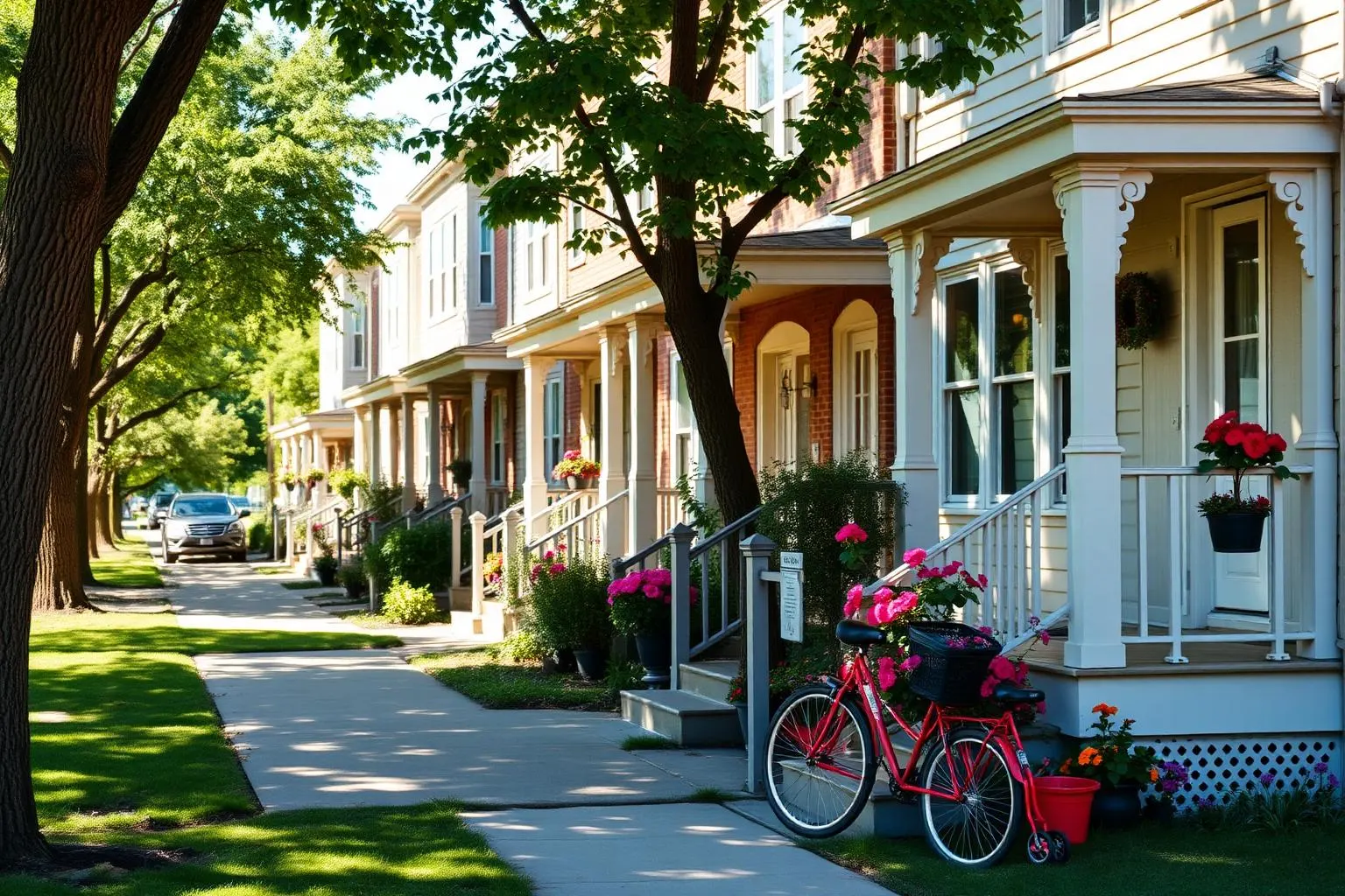
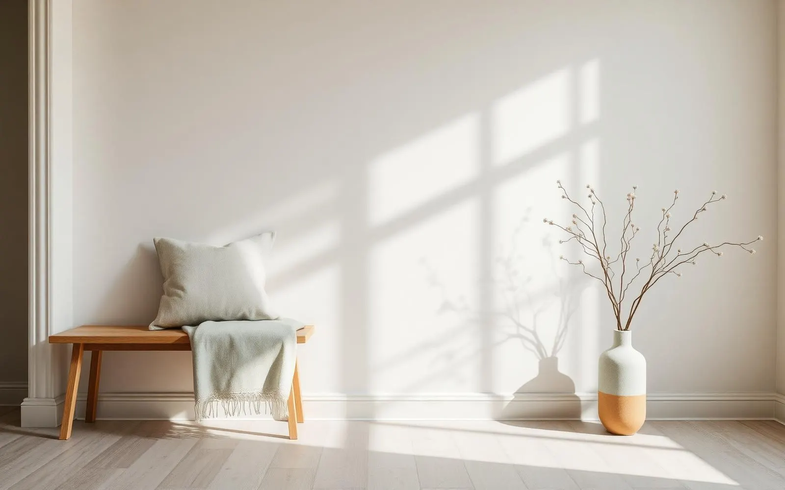
A narrow rowhome in Lititz, in January, in the late morning. The front room has an oak bench along one wall, a ceramic vase on it, and above that nothing at all. Just plaster, limewashed, holding the low winter light and changing color slightly across the day. Everything else in the house is ordinary. That wall is the reason the room feels the way it does, and it cost nothing, and it is the single hardest thing to talk a person into.
We are trained to treat blank wall as unfinished. A gallery wall goes up, or a large canvas, or the shelf with the frames and the small plants. The instinct is generous and the result is that the eye has nowhere to stop.
Why the empty wall works
A room is read the way a page is read. Text with no margin is exhausting regardless of how good the sentences are. A wall with nothing on it is the margin. It gives everything else in the room a place to be looked at from.
It also does something practical in an old house. Plaster and limewash are not flat surfaces. They hold shadow, they change through the day, and they are genuinely interesting to look at when nothing is hung in front of them. The wall itself is the artwork, and it is different at eight in the morning than it is at four.
One per room, and mean it
The rule that holds up is one genuinely empty wall in every room. Not a mostly empty wall with a small mirror in the corner. Empty. In most rooms it should be the wall you see first when you walk in, or the wall behind the seating where nobody sits looking at it.
Everything else can be as full as you like. The discipline is in the one.
Legs, and the illusion of floor
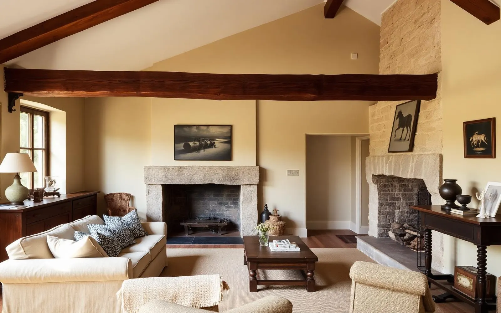
The same principle applies horizontally, near the ground. A small room reads larger when you can see the floor continue under the furniture. Sofas and chairs with visible legs, a table with an open base, a bench rather than a chest.
Skirted furniture and floor length upholstery cut the room off at ankle height and stop the floor where the sofa starts. In a large room that is a fine choice. In a rowhome front room it is a hundred square feet given away for nothing.
Spend on light and window function first. Decoration is the cheapest part to change and the last thing to buy.
Where the money should actually go
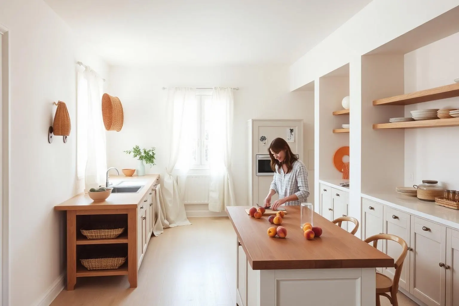
In the order that matters: how the room is lit, how the windows work, and then everything else. Light placement is the thing people notice and cannot name. A pair of lamps at eye level and a warm bulb will transform a room that a new rug will not.
Windows that open, close, and hold their position are worth more to daily comfort than any piece of furniture in the room. Decoration comes after both, partly because it matters less and partly because it is the only part that is easy to change later.
The version of this that touches a mortgage
The same hierarchy applies to money at a larger scale, and I will say it plainly because it comes up in my work every week. Finance the things that are structural and permanent. Pay cash, over time, for the things that are taste.
Roof, systems, windows, structure, insulation: those belong in a loan, because they last as long as the loan does and the house does not work without them. Furniture, paint, decoration and finishes are the parts you will change your mind about, and financing a decision you will revise in four years is an expensive way to be temporarily certain.
Which is another argument for the empty wall, if a mercenary one. It is the only design decision that improves a room and costs nothing, and it looks better in year ten than it did on the first afternoon, when the light comes across the plaster and there is nothing in the way of it.
What to take from this
- Leave one wall in every room genuinely empty.
- Furniture with visible legs makes a small room read larger.
- Spend on light placement and window function before decoration.
- Finance systems and structure. Pay cash for taste.
Where to go next
The Journal is written for people thinking about homes, not just financing them. Articles are educational and reflect general observation about Pennsylvania housing, architecture, and daily life. Nothing here is an offer to lend, a commitment to a rate, or an appraisal of any particular property. Corie Adams, NMLS #1875205. Network Funding, LP, NMLS #2297. Equal Housing Opportunity.